Reimagining
Amsterdamse
Poort
Amsterdam, NL
Location: Amsterdamse Poort, Amsterdam, NL
Year: 2017 - ongoing
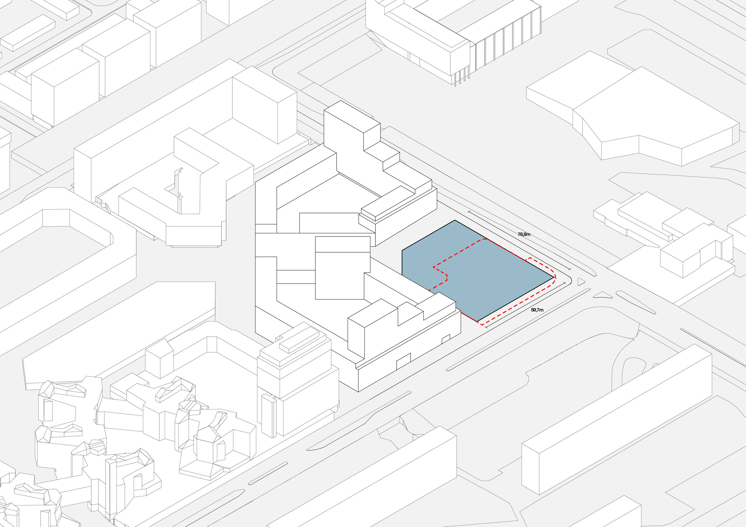
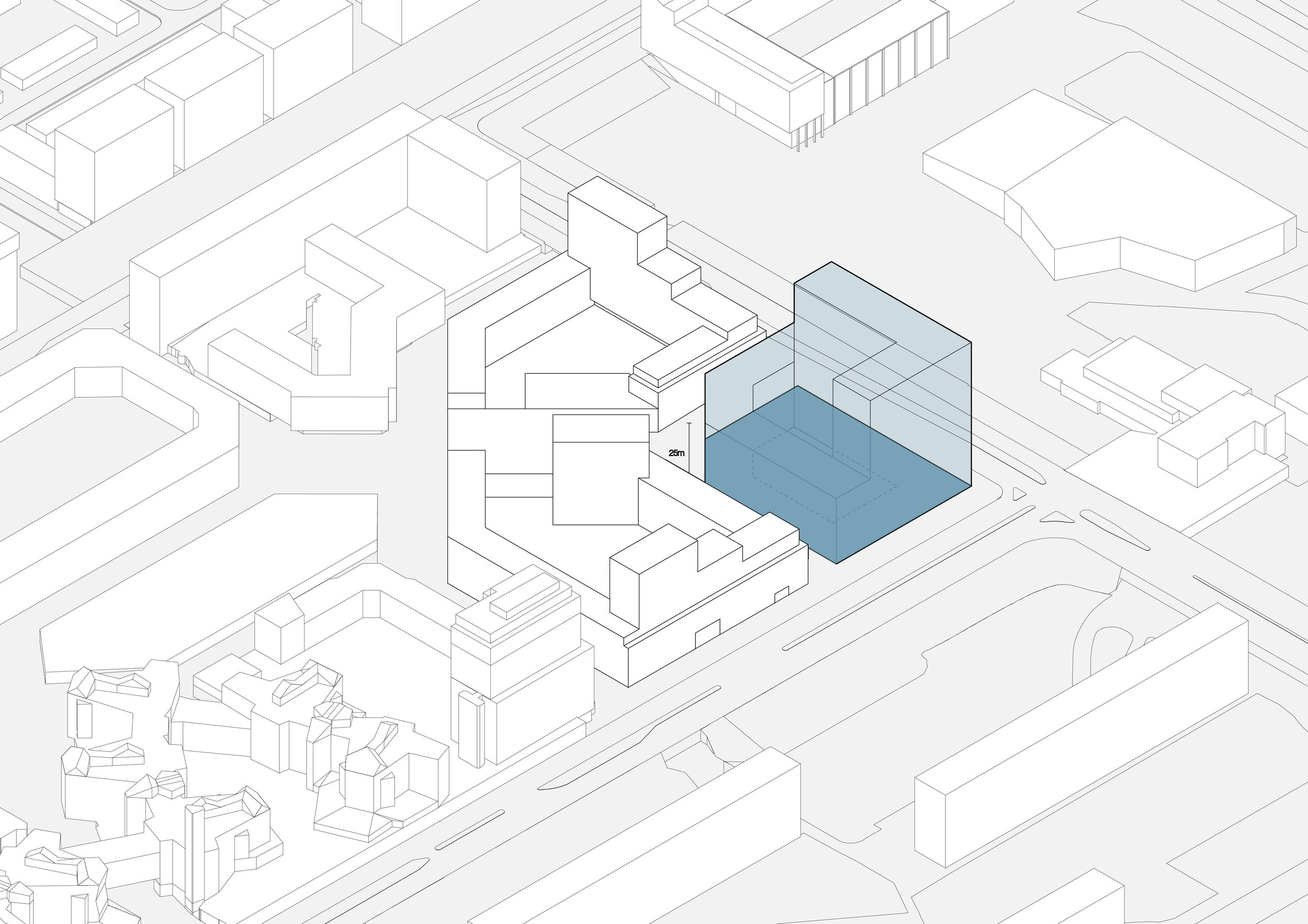
Site Footprint: 6.510 m2
FSI Netto: 3.6
Gross Floor Area: 23.987 m2
Parking: 17.220 m2
Total: 41.207 m2 (incl. underground parking)
Total Number of Apartments: 243
ranging in sizes from 50m2, 70m2 and 80m2
Program: Residential, Sport, Public
Client: VLPO, Blauwhoed
Sustainability: Cauberg Huygen
Structural Engineer: IMD Raadgevende Ingenieurs
Installations: Huygen
Landscape: MOSS
Other Architects: MVSA Architects,
Paul de Ruiter Architects
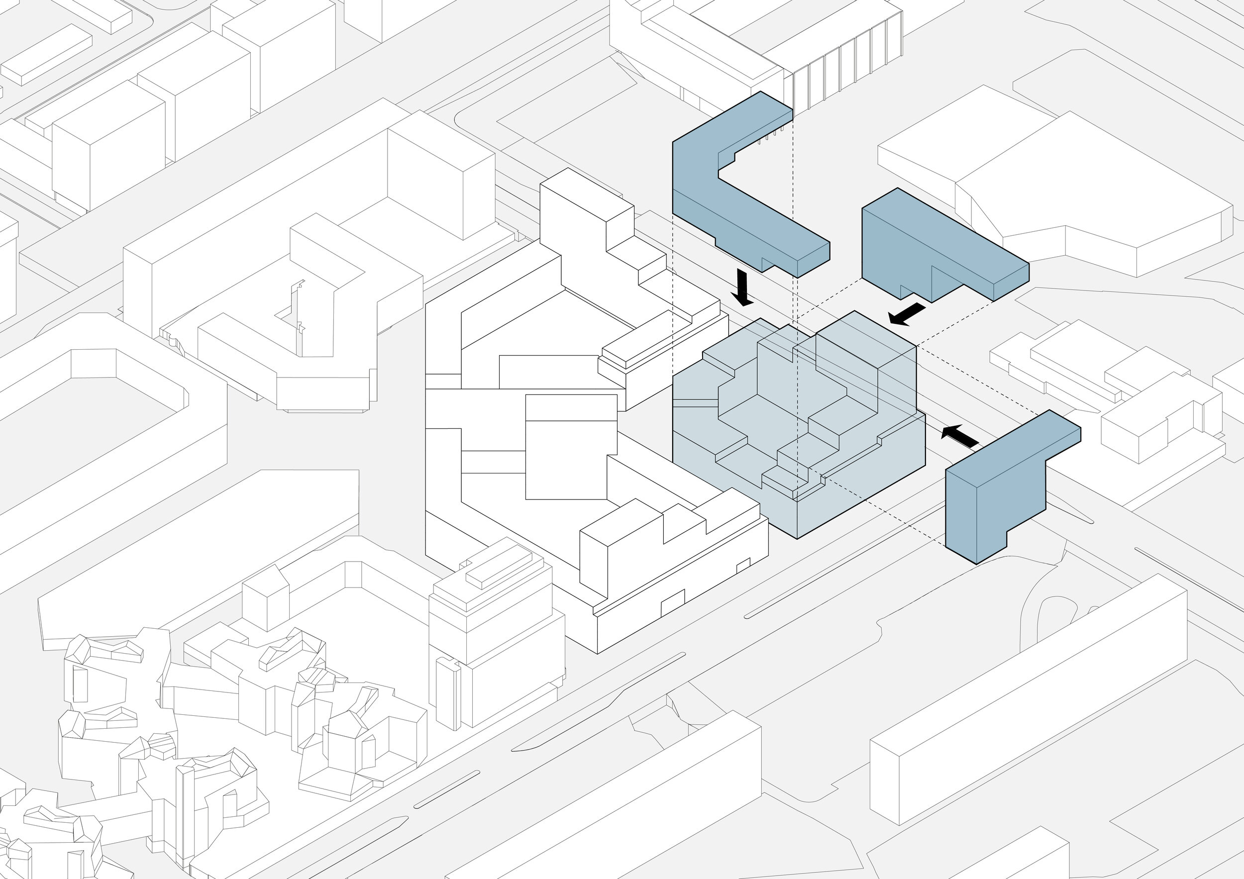
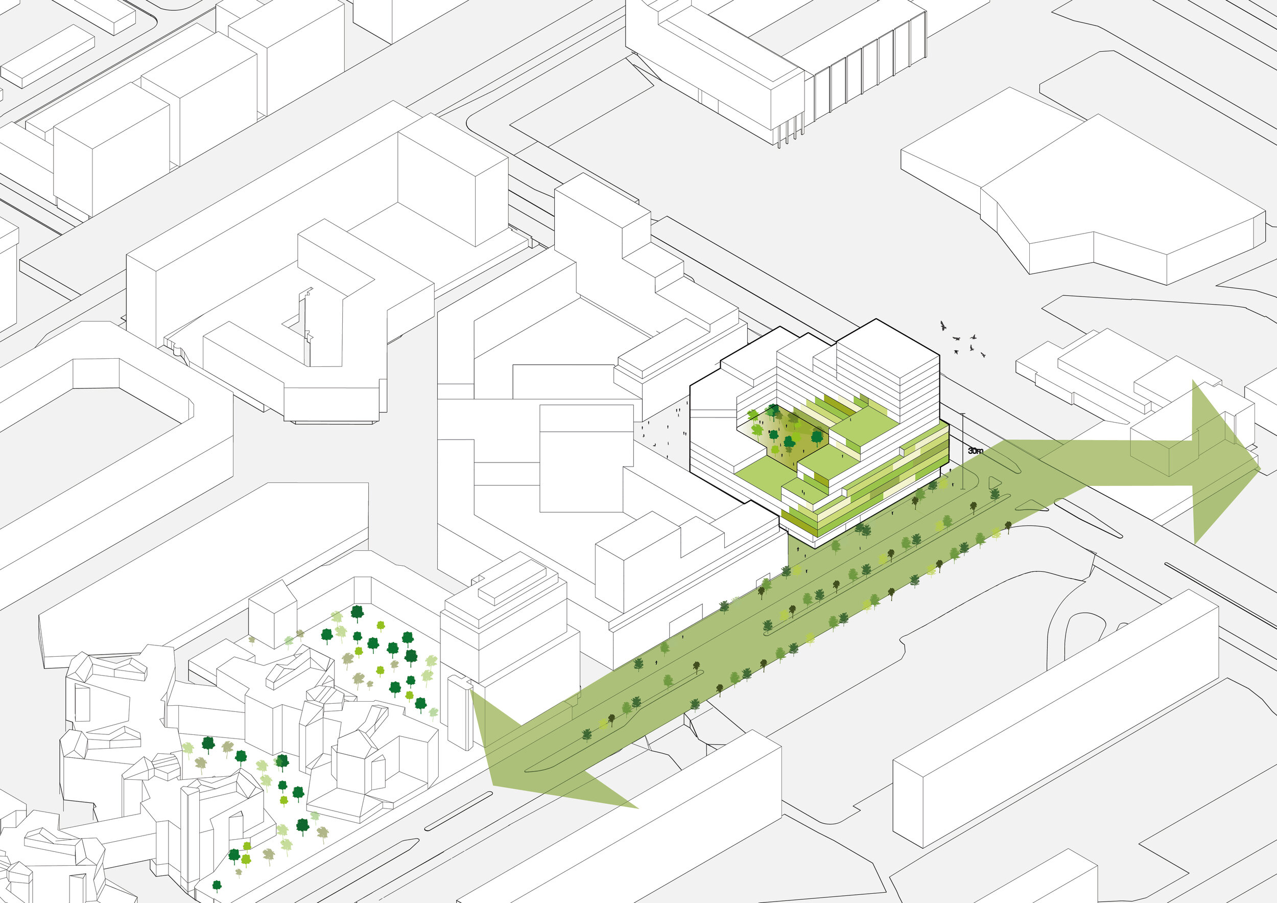
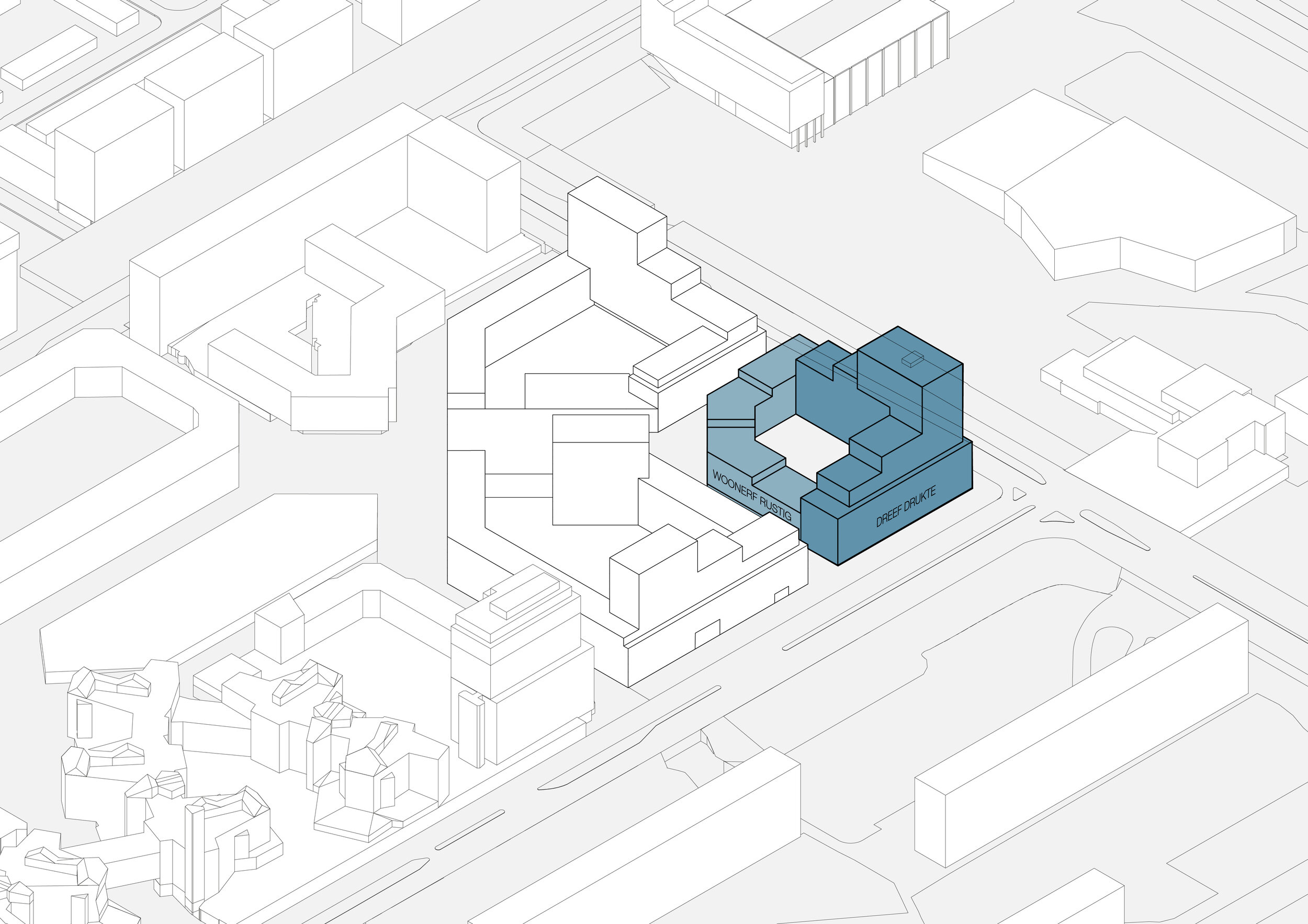
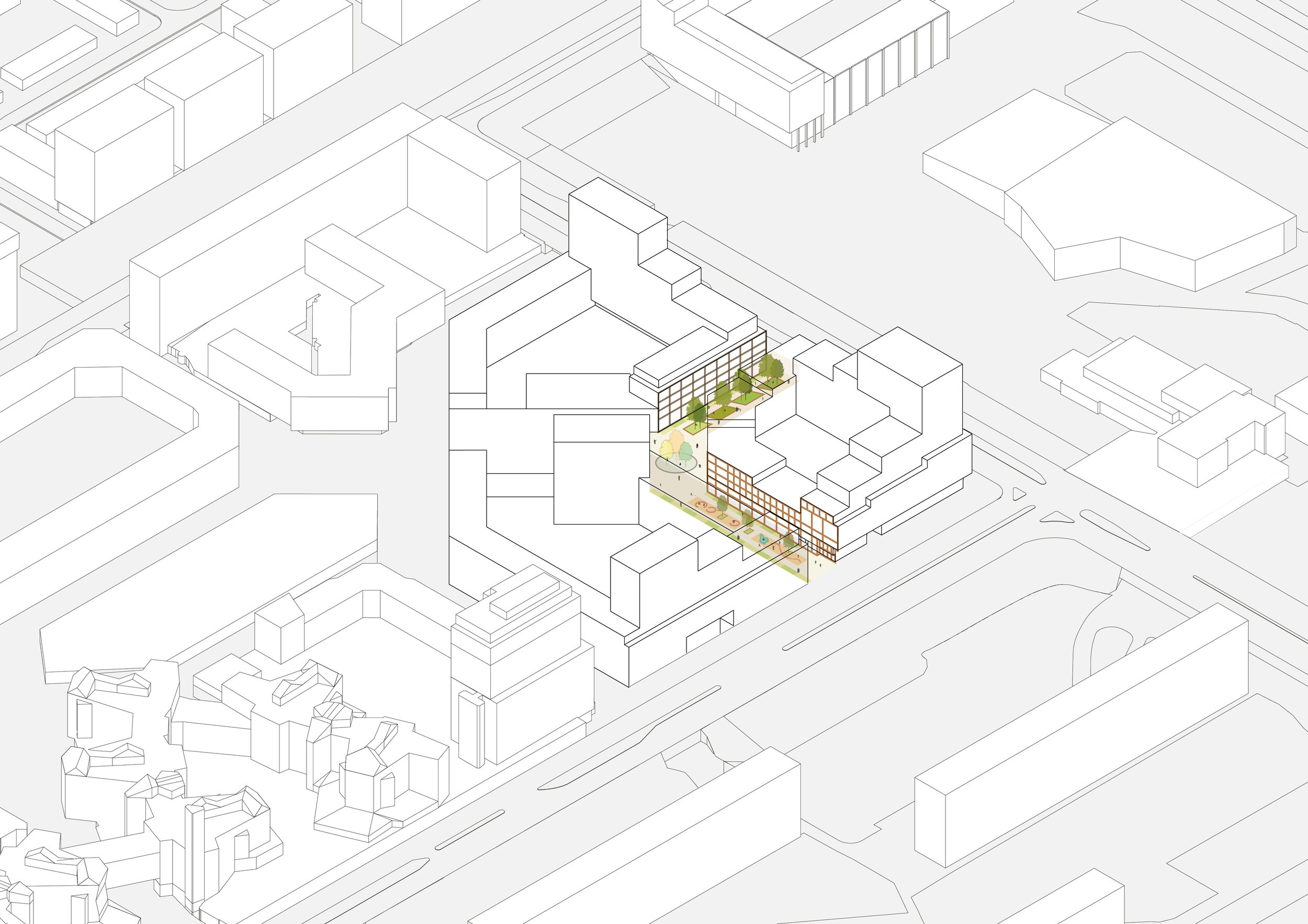
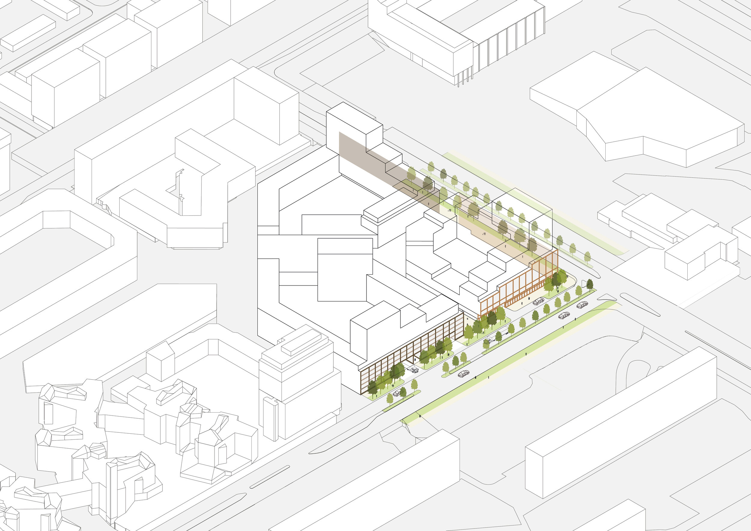
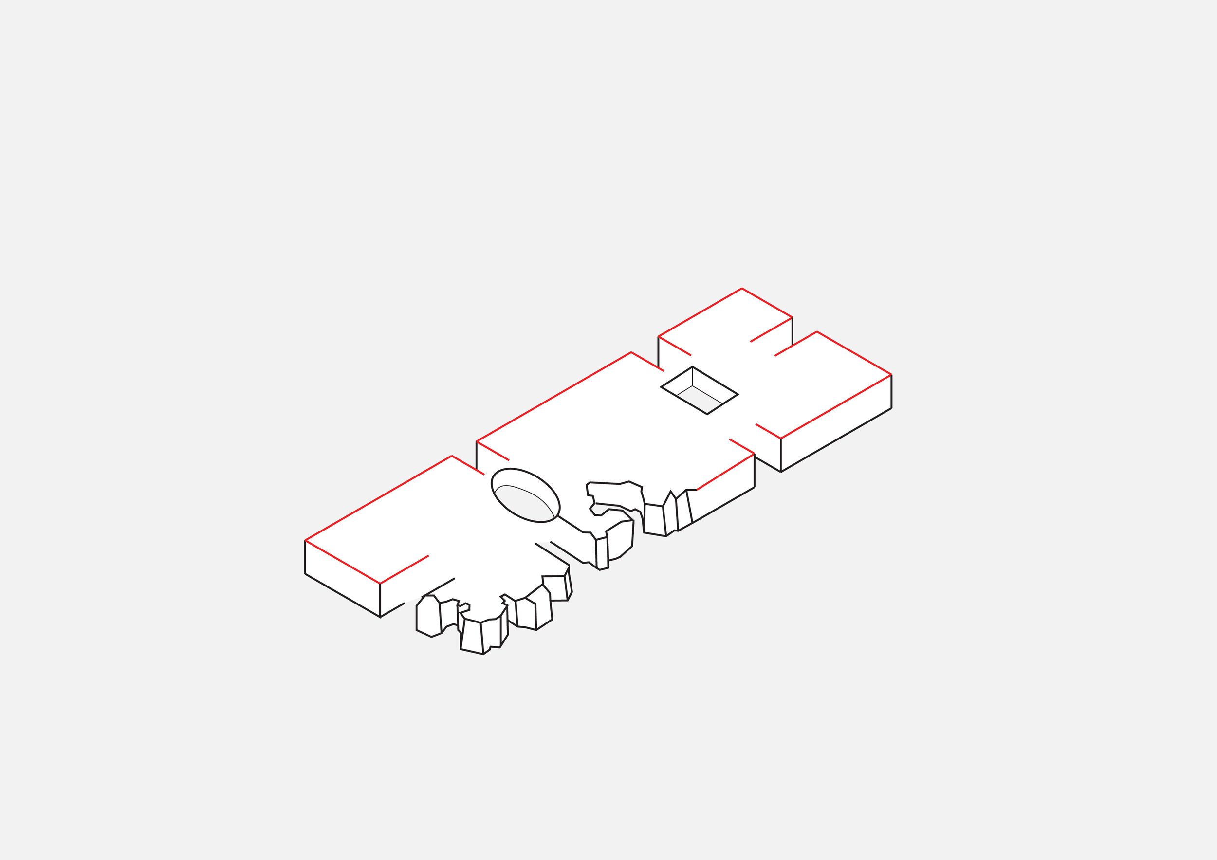
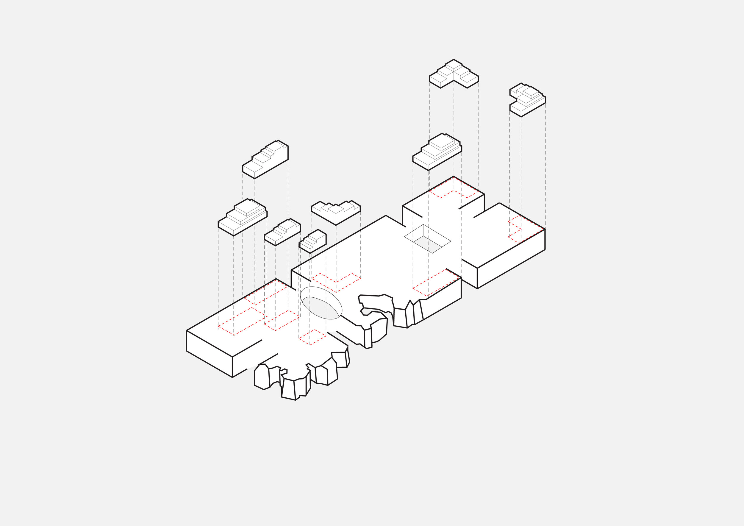
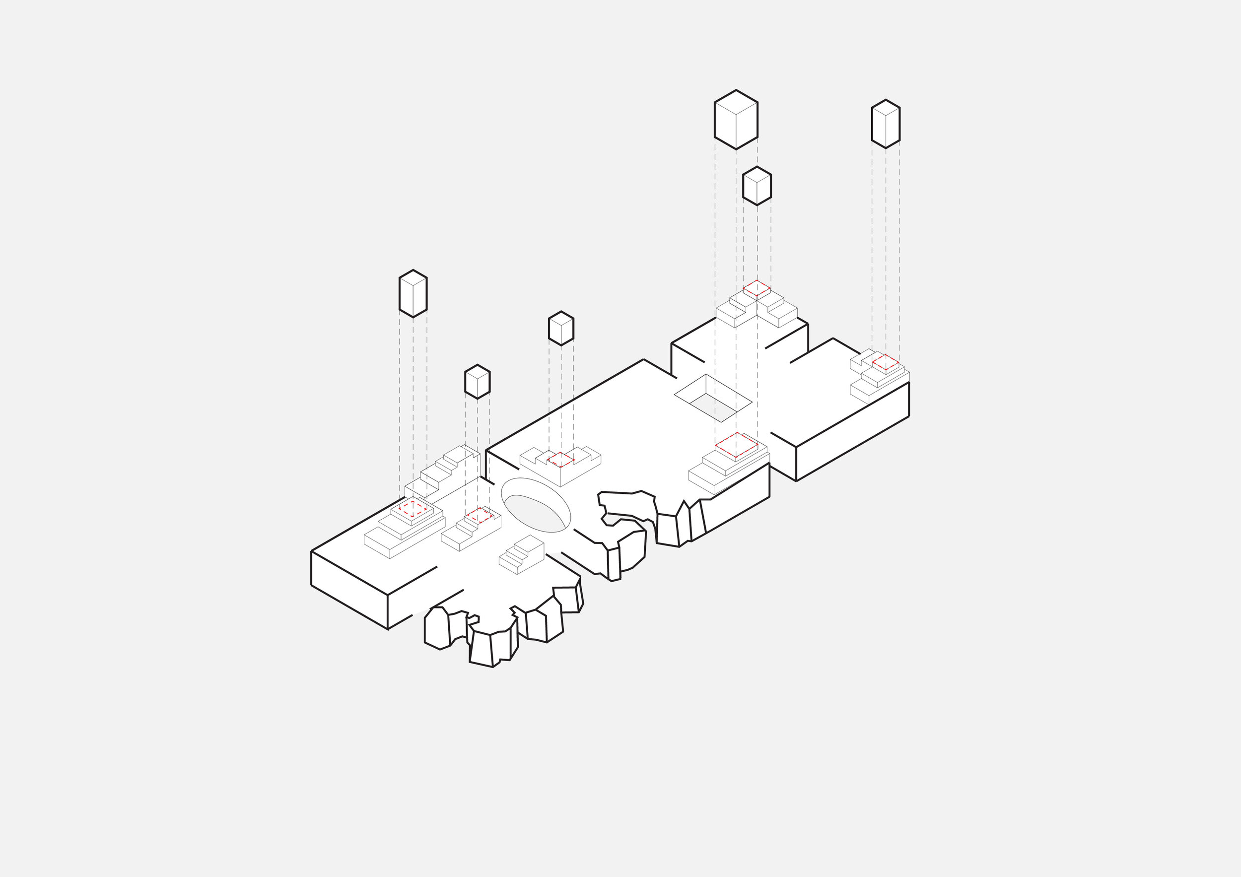
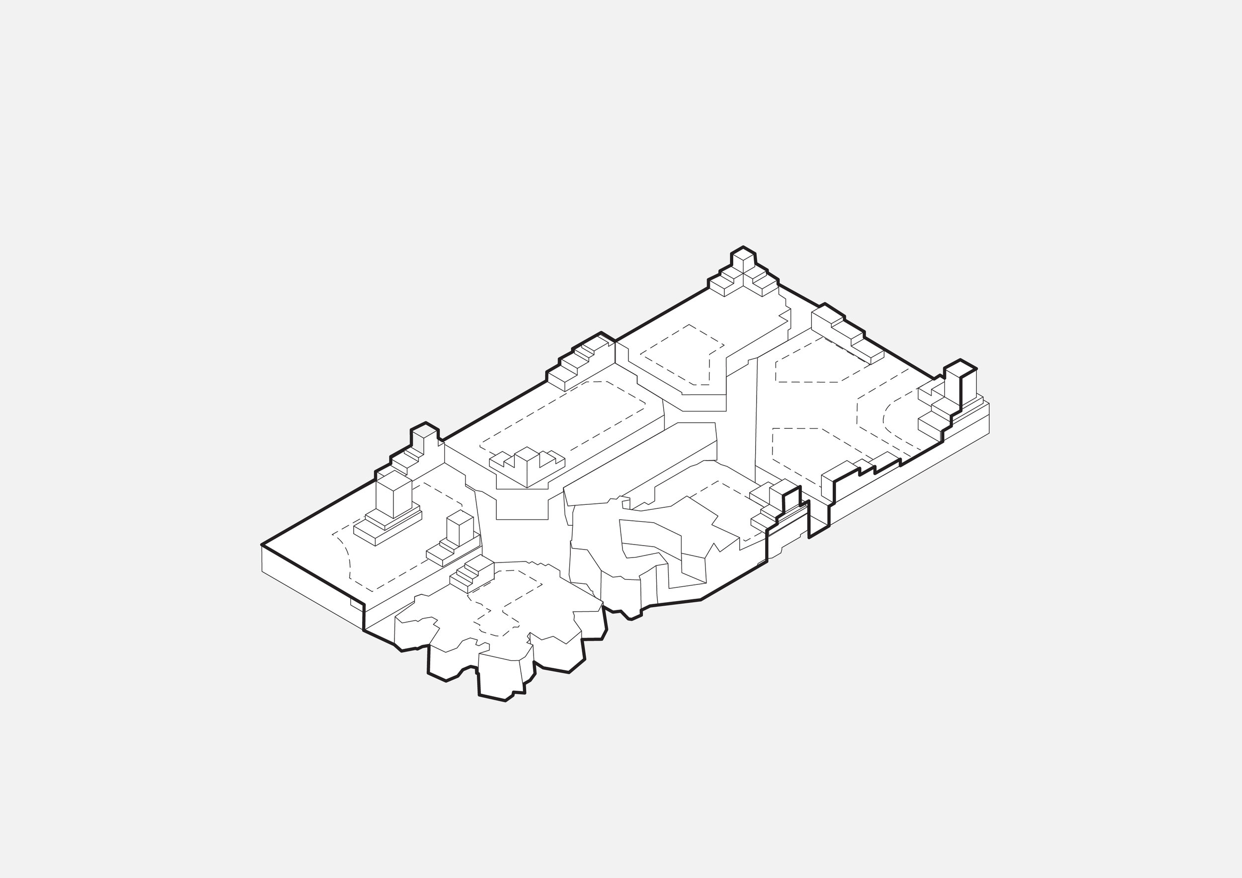
HODO is a high-density mixed-use residential project located in Amsterdamse Poort, which has developed into the city’s second urban centre, attracting nearly 16 million visitors per year. The project forms an integral part of Cluster 7, a key component in the transformation of the southeastern edge of Amsterdamse Poort into a lively, inclusive, and sustainable district. Taking the connection between the entertainment area and the shopping centre as the organising axis for the masterplan, the program integrates housing, retail, and parking facilities in one coherent urban composition. Cluster 7 is divided into three residential blocks that together form a unified yet varied architectural ensemble. This finer urban grain prevents the formation of a monolithic “super block” and creates a more human-scaled and permeable city fabric. Between blocks 1–2 and block 3, a green pedestrian woonerf provides a quiet inner street and social meeting space.
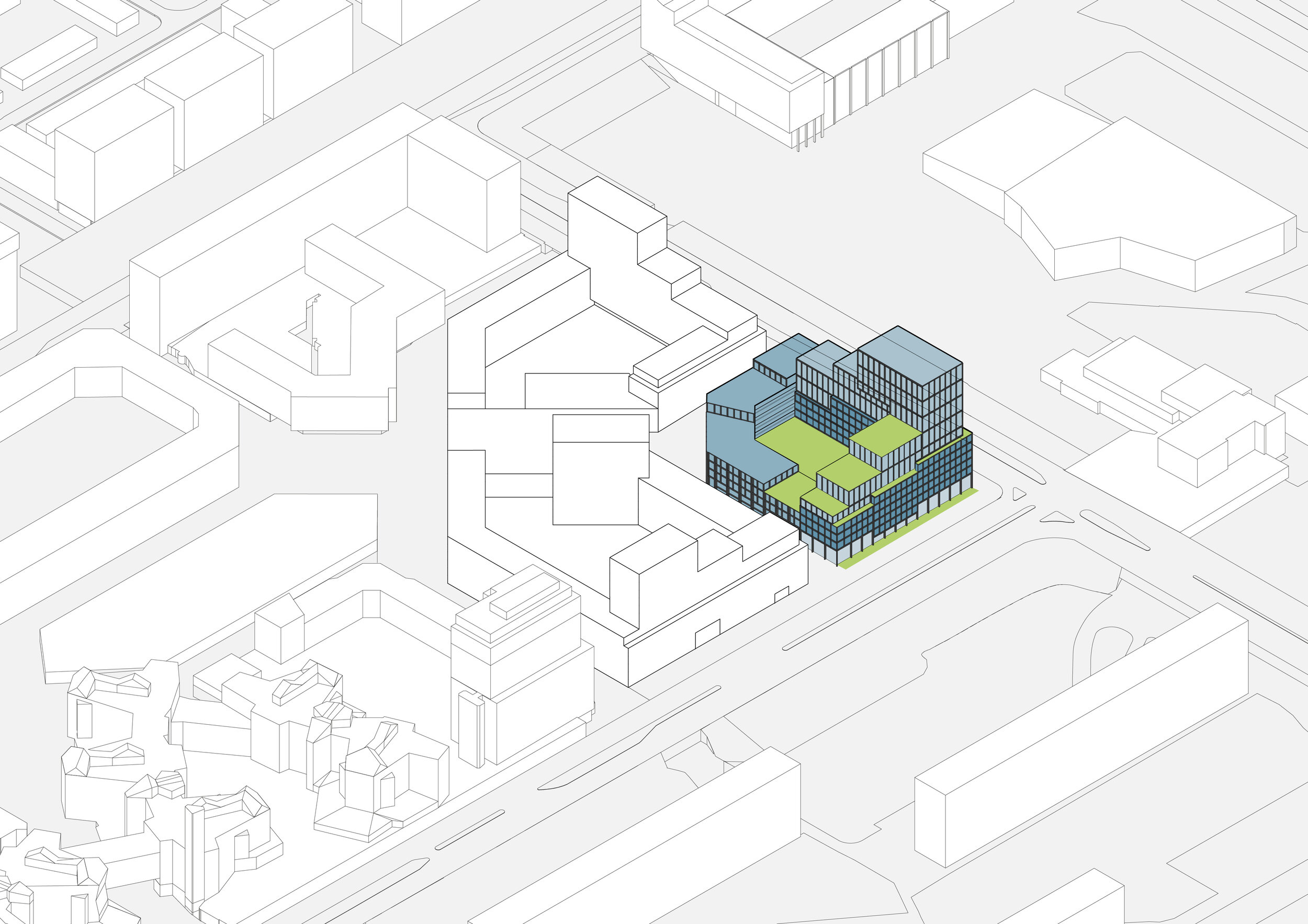
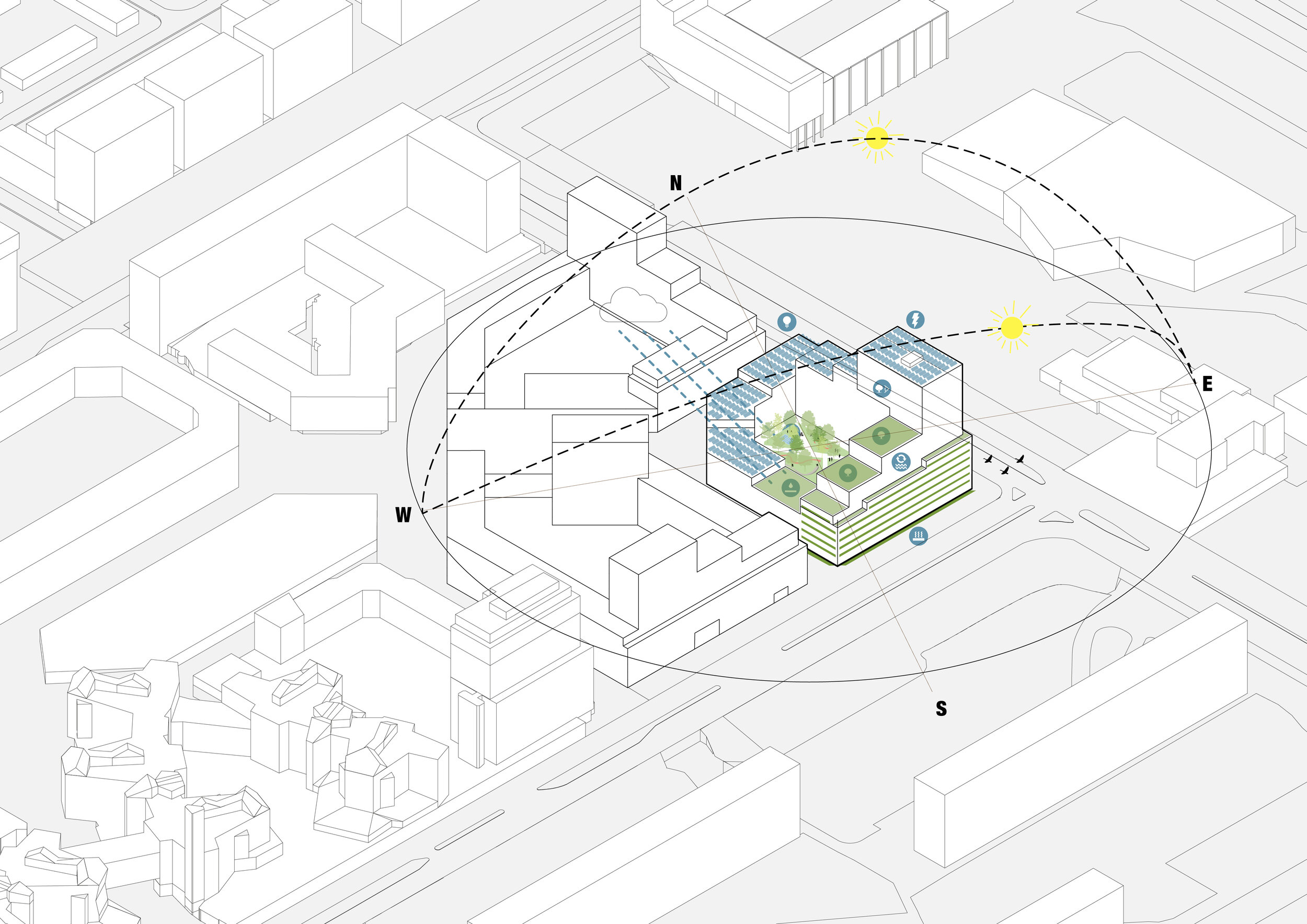
The design embodies a vision for healthy, sustainable, and socially inclusive urban living, expressed through accessible roofscapes, an affordable housing mix, active plinths, and nature-inclusive façades. To minimise the impact of the building mass on the public realm, a clear distinction is made between the base and the top. The robust and animated plinth anchors the complex to the street, while the lighter, more expressive upper volumes give the ensemble an elegant and recognisable silhouette.
The colour palette reinterprets the tones of Amsterdamse Poort into warmer shades of dark brown, gold, and earth green. Materials such as brickwork, natural stone, wood, steel, and aluminium reinforce this character, while the lighter metallic top reflects daylight and reduces the visual weight of the high-rise. Green roofs and façades bring ecology into the architecture, providing cooling, biodiversity, and outdoor space — making HODO both urban and nature-inclusive, a sustainable anchor for the renewed Amsterdamse Poort.